Wednesday, February 23, 2011

You Can't Miss: Music Album Covers

This week on the blog I follow, EyeBlog, there was an entry about a design exhibition held in Tokyo. Covers were featured from Ronald Clyne for Folkways Records. I really liked the images they posted because of the type treatment. Here are two examples in particular that played with the type to produce a cover design: 


Typography is something I'm working hard to get better at. I love creating typography illustrations, but I think it can be so difficult just trying to find an appropriate typeface for headlines, subheads, and body copy. I find it difficult to reflect the personality I'm going for with fonts, some times. I've been making it my goal to spend more time searching through free font sites like dafont instead of just settling on something because it "looks nice." Type can completely change the appearance of your design, so I need to get used to playing with it! 

Response: The September Issue

I loved this movie! I was so glad we got to watch it in class. I hadn't ever heard of the documentary and I have a deep love for fashion magazines, especially Vogue, so this was really fun to get into. The overall atmosphere seemed so intimidating, and that stresses me out a little bit. I don't know if I could handle having Anna Wintour as my boss, myself! It's crazy to think about placing myself in the fast-paced world of the magazine industry.

In the movie, Grace's role as creative director appeared to have a lot of pull, but she seemed entirely too overpowered by Anna. I think there's a lot to be said for the creative director's ability to understand a concept visually and to present images that are not only appealing, but original and have a certain impact. It was obvious that everyone appreciated her input and considered her a visual genius, but I thought that everyone seemed much more preoccupied with Anna's opinion. This made it difficult for Grace to have her way as the creative director. I was disappointed by this. I thought Grace should have had more of the final say in a lot of matters.

I was especially in love with the 20's photo shoot that Grace set up. The images were so striking! It was impressive that she was able to incorporate a modern style in such an outdated atmosphere. I appreciated her romantic view of things. The soft photos got a certain message across that seemed perfect for the overall concept. I was so mad when Anna pulled out more than half of her spreads! The girls in the pictures maintained a sense of activity and motion while being caught in a still frame. There was something about all of the images that were so breathtaking.


photos credited to Vogue's 2007 September issue

In the case of Vogue, I believe the role of the creative director is more overshadowed by that of the editor-in-chief, but I don't think this is the type of relationship that is necessarily common in other publications. I wouldn't exactly say that I think of the creative director as an equal to the editor-in-chief, but they are in charge of the way a magazine is represented visually. I wish that Grace would have had more of an input in whether or not more of the images were able to be used, not just in the features she presented, but throughout the magazine. I believe that the editor should have a responsibility not only to ask the advice and opinion of the creative director, but to follow their direction.

For my life, I don't know if the creative director position is one that I want to pursue. It seems like this person is so overwhelmed by their life at a magazine, they don't have much of an opportunity to live outside of it. The pressure of having to coordinate the visual representation of an entire publication throughout seems entirely too overwhelming for me. I like giving direction, but I don't know if I would want the stress of having to give direction to an entire staff. On the other hand, how exciting would it be to be so influential in a publication like Vogue? It's definitely an goal to strive for.

Critique: Modern Midwest Prototype

As I made changes to my magazine prototype for my early morning presentation on Tuesday, the resource that helped me the most was the creative library. Having access to such a large database of photos that were usable was so helpful to me. It changed the entire appearance of the magazine because I was able to get rid of the hideous, pixelated images I was forced to use before. For the cover, especially, it helped me present a much better version of my concept.

When the publishing team e-mailed us their mission statement and story ideas, it sounded to me like that they wanted Modern Midwest to look trendy and young, but while still retaining a sense of sophistication and elegance. I wanted to push my design towards that goal of sophistication because I thought that would make the whole appearance look clean, fresh, and most importantly, modern.

The first change I made was to my logo. I sketched out a lot of my ideas and scoured over the books that Jan assigned us for the class, as well as some other design books I have on my bookshelves. I pulled ideas from all sorts of places and tried to be as original as possible. Here are all of the logo ideas I came up with:


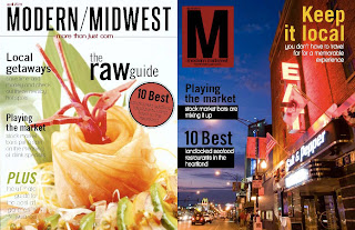
Out of these options, I liked the yellow-boxed "M" example. I know it's hard to see at this size, but that one has the date above the M, then it says "modern midwest" directly below it, and below the name of the magazine is the tagline. The other two that I liked were the bottom two on the right side of the page. I thought these were the most fitting and achieved the overall concept I was going for. 

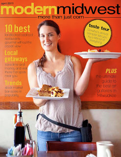
After I narrowed down my logo options, I started working on my cover design. I chose three different photos that captured different aspects of the magazine, including a human-interest side, nightlife, and food. I wasn't sure what the publishers wanted to focus the most on, so I decided I would give them 3 different cover examples that presented all the logo ideas as well as different feels to the magazine. 

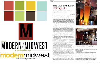
I didn't make very many changes to my department page or feature spread. I only swapped out the photo I used for the feature spread. The one thing I wish I would have done was include a sidebar example for the department page. I wanted the publishers to know that I was going for a more sophisticated, edgy look, but I didn't want them to feel like a sense of humor and playfulness would be totally lost if they went with my concept. I feel like a sidebar would have lightened up the mood, broken up the text, and given them a more visually pleasing example, but I didn't think about the importance of including it until I was actually presenting. Not sure if that will hurt me, but it's good to keep all this in mind for the future! Here is my final draft of the Modern Midwest prototype:


Good luck to everyone on their magazine projects! I'm excited to see how everyone's designs turn out throughout the rest of the semester. I'm so grateful for this experience because I think it's going to be one of the most important portfolio and resume boosters we will have gained from this capstone. 

Wednesday, February 16, 2011

You Can't Miss: Saul Bass

There was a very fascinating post on the blog I follow this week, Eye Blog, about a designer by the name of Saul Bass. I was surprised to find that his movie posters appeared throughout the '60s because the style of them is so highly modernized and contemporary. I didn't know of Bass before I read the post, but he was obviously a highly tuned visionary. These two examples from Eye Blog are my favorite clips of his work.


The top poster has a man in the mold, but the man is revealed only in his muscular form. That image struck me when I discovered it. His concepts are simple, yet in ingenious. He is very successful at using just a few colors (most of his posters only have two) and making a limited palette work to his advantage. I try to be simplistic in my own designs, I really hate clutter, so these graphics were inspiring. I still can't believe they're from the '60s! This guy was way ahead of his time. 

Response: Web and App Design

Unfortunately, I was sick during the Vox staff meeting this week, but I did hear about the exciting new program that was presented to us called Mag+. Essentially, this software allows one to design an app in InDesign, using some restrictions, then transfer that over to an app without having to go through the tedious coding that is usually involved.

I have spent little time designing for the Web, and even less time trying to figure out application designs, but I think these two skills could make or break it for me in the job market. I really would like to be more aware of how to use programs like Flash and Dreamweaver, but I haven't had the free time to mess around with them myself and I haven't been in a situation where I was forced to learn them, yet. Working with the Web and application designs kind of intimidates me, but I really need to get over it. There's just no way around it, magazines are utilizing the Web as one of their primary tools to reach their audience. The audience expects journalists to be tech-savvy, so my chances of getting a job, in the very near future, will greatly improve if I can manage a little background information now.

I'm excited to start breaking into this field and working with online material to produce a portfolio-worthy media package. It's really great we have access to programs like Mag+ because it sounds like it will make doing all these things much easier for me, the designer.

Critique: Modern Midwest Prototype

I agonized over the designs for my prototype. I was so frustrated by the fact that we basically had nothing to go off of (in terms of copy and photos), and that frustration caused the project to take more time than necessary. I have to admit that I felt completely lost. How do you design a magazine from scratch? Where's the handbook on that? I wanted to try and make an energetic personality for the prototype because I thought that would make it stand out amongst the many other lifestyle magazines that exist. I stay far, far away from that style of publication because they bore me, or so I thought.

After starting this project, I have begun to look at lifestyle and food magazines in a whole new way. There's something to say about finding elegant photos of food that haven't been done before. The people that work for publications like these have to put an endless amount of time and consideration into choosing the design and style of the publication because I feel that they have a difficult task to stand out. With other commercial magazines, sex, fashion, and impending celebrity doom sells. I think those topics are more likely to get plucked off a newsstand before a lifestyle magazine. So, my goal was to try and make the design as visually pleasing as possible so that I could grab the attention of a younger demographic. So, here's my prototype.


Now that I know how to access the creative library, I'm going to utilize that resource for way better photos to use in the presentations for next week. I think one of my biggest hurdles is finding appropriate fonts. Fonts plague me. Some times I have an eye for them, and other times I feel completely lost. I wanted to go with a sans serif for the fonts because it seems more modern and chic, to me. The one thing I plan on spending more time with before our presentations next week is my logo treatment. It needs help! Hopefully that will give me some practice for the upcoming 20/10 assignment too. Good luck to everyone presenting prototypes next week!

Wednesday, February 9, 2011

You Can't Miss: Soviet Architecture

I found this post on EyeBlog this week. Photographer Phil Sayer had his images of Soviet architecture displayed at a gallery in London recently. His photos appeared in a breathtaking photo essay, which appeared in a magazine called "Domus" in 2001. Here is my favorite spread from the feature package:


I know it's kind of small, but the picture on the left is one of the best naturally framed images I have ever seen. The photographer has an amazing skill for capturing a certain desolation that is evident from the environment, while also playing up the extraordinary architecture he is featuring. This makes shooting buildings look so eloquent.

Review: History of Design and Judging

I didn't quite realize their was going to be such a serious judging process involved in Tuesday's lecture until I got there. After being all thrown off by the snow days, I've been a little slow getting re-prioritized again, but what's new. I ended up choosing the swanky marijuana design done by Philadelphia Magazine. The color palette impressed me most with their feature design. I never thought of weed colors being so calming and vibrant, which I thought was a very interesting reaction. It was surprising and innovative. Being that it was such a potentially contentious story topic, the design did a great job of supporting the text while not being vulgar or intrusive.

After reading the History of Magazine Design, we were asked to come up with contemporary examples of some of the old-fashioned techniques we read about. It seemed to me like there were many, many similarities, as far as basics, staples and foundation design tactics, that continue to be used today. It's crazy to think how difficult it must have been for people in the early 1900s to work with page design and layout. My respects to them all. Here are my examples:


This example is from Nylon, one of my absolute favorites. This loud photo montage creates a visually pleasing department page that mimics the technique used in the following "Fetish" example from 1980. 


The designs are definitely not identical, but I thought they were very similar in the sense that both used photos and distorted the size of the figures and characters to create a focused illustration. The idea of using giant pictures to grab your reader is definitely still in use!


This example is also from "Nylon." The following is from a 1916 McClure's, and is my comparison to the above layout.


The columns and structure of the text and photos are very rectangular in both designs. "Nylon" even uses that geometrical design in the corner that stimulates the shape concept it's going for. The reading said that this McClure's example is reflective of the trend towards "logo type" for magazines. Each of these examples uses a boldly different type for their headlines, and a smaller version for their deck. Although it's not clear in the McClure's design, Owens also talked about the trend towards placing text on top of photos, or running them in some correspondence. Some of the earlier examples Owens features were so outrageously designed - text seemed to come from nowhere and images had no flow and were jarring, rather than informative. Using a structured grid like the examples above helps create a peaceful coexistence between text and photo, like Nylon achieves.


Although the above example is a studio shot, I thought it closely mirrored the following example done by Leslie's Weekly in 1903.


As discussed in the reading, this is one of the first examples of design in which a single shot was stretched across an entire page, notably the cover, then text was placed over it. Often, a photo can say a lot about the story you want to tell, and these two photos are the perfect simple shots that are clear and provoking. 


Critique: Trying to keep up

Next week is not looking pretty for me. I have a 8-page feature spread rough draft due next Tuesday and the capstone project prototypes are also due next week. I have an extremely busy weekend ahead of me, but this week was, of course, really slow.

To keep myself busy, I caught up on some design work I am doing for my internship at Hot Box Cookies (and yes, I get free cookies). They are now serving Tiger Stripe Ice Cream to adorn their delicious ice-cream cookie sandwiches. By the way, did you know that ice-cream is hyphenated when used as an adjective? Crazy. Thank you magazine editing. So, here's the semi-finalized ad I designed for Hot Box:

I was pleased with the ad concept and design I had come up with so far, but I think there may be a few elements that could be perfected. The one thing that really sticks out to me is the separation that seems to arise between the contact information elements and the big ad with the tiger. I liked having the little symbols to correspond with the contact info, but I want to find a way to make them more cohesive with the larger ad. Then again, maybe ads aren't supposed to be like that? I haven't done much ad designing, but I kind of like it. It was fun and playful. Especially for Hot Box, it's easy to be creative when working on their designs because their business style is relaxed and more playful. Any ideas, let me know!

Wednesday, February 2, 2011

You Can't Miss... the Snow!

I finally ventured out into society today. My roommate and I ran our errands on foot, stopping by the J-school and the columns because I just can't stay away! Here's my roommate standing in the entry way between Neff and Walter Williams.... It's such a pretty scene.

(Don't you just love the fabulous shadows...)

I spent the last few days bundled in several blankets, firmly glued to the couch, catching up on homework and surfing the web. I can't help but to continue returning to this fabulous artist's site because her prints just amaze me. Natasha Westcoat is a Michigan native with a vivid style that I'm helplessly drawn to. I love her swirly trees and simple prints. I recently discovered her line of horoscope paintings and am very intrigued with the dimension she creates through the positioning of the characters and the color palette she uses. I think "Virgo" is one of my favorites...


Response

While I was snowed in this week, I plowed through the massive reading Jan assigned to us for the week. It was kind of nice to have a few extra days to mull it over because it was so interesting. I love seeing how magazines have changed over time. I really loved this 1957 Vogue feature:


The red of her lips and fingernails really pop and make a statement for themselves. For a spread about eye makeup, I thought the photo concept was genius. By photographing her peeking through her fingers, the designer also got to incorporate a stand out red as well as multiple beauty elements, lips, nails, eyes. The eyes on the right side are so strange! They stand out in a very 3D, graphic way. Usually, designers don't pull the eyeball off the model, so I thought this was an interesting idea. 

As the article stated, Europeans were less likely to play up white space in their designs because of their circumstances. As nations tried to recuperate after WWII, magazine designs were valued according to their functionality and ability to put as much on a page without cluttering it. There wasn't as much money to print excess pages, so the designs were less likely to incorporate white space. How interesting. Who knew? Here's a great example of the American obsession with white space from a 1957 Playboy cover:


One of the stories that caught my eye in my blog this week was the "stroboscopic titles" of Gaspar Noe's new film. (I have no idea who Gaspar Noe is, but he's obviously immersed in the European techno world. Here is Noe's typographical work for his own name:


Ahh, it kind of gives me a headache if I look at it for too long. Using the O as his center allows this design to work, but I don't think I could be so techno-hip. Not my favorite, but I can definitely say that it grabs my attention! 

Spring Preview Critique

I had such an exciting week with design! I was thrilled to have my cover concept be chosen for the Spring Preview issue. I spent many hours in the computer lab the night before it was due trying to perfect my typography. It was a nice evening, actually because I got to know some of my fellow designers a little better. Just when we were all about to crash, Kaylee had the brilliant idea to fire up Pandora and turn on the Justin Beiber station. Haha, what great inspiration. Anyway, here's what I finished before last Friday and presented to the editors:


As you can tell, I was no where near finished with my feature spread because I had spent a majority of my time working with the cover and the splash page. Pictured above is the splash page and feature spread. The one thing I failed at with this project was time management! I was really disappointed that I didn't get to do exactly what I wanted with my feature spread, but I think it was obvious I had put a lot of time and effort into the cover/splash page. I didn't want to do a trite spring theme, so I tried to incorporate the bugs as a way to pull out something kind of gross and different. I ended up winning the competition for my cover design, so here's a before and after of my cover:


(Sorry about the original photo, I had taken a picture of it, but didn't end up saving the original!) Erica Mendez had the fabulous idea of incorporating the dirt, so I borrowed the idea from her. Instead of using the flower and leaf, I went with the bug theme and substituted a ladybug and a butterfly. It really glued the concept together better. Legibility was an issue, so I tried to make the shapes easier to work with. Because "performing arts" is so long, the earthworm was an excellent help! By making the bugs a solid color, the type stood out more and it also tied into the splash page and feature spread concepts. I really loved playing with this design. I'm still pretty slow at Illustrator, which ended up being the reason why I didn't have much time left over for the spread. My goal is to really familiarize myself with some of the Adobe programs that I haven't spent much time with. Just knowing some basics would really improve my design capabilities. 

I had a great time working with Aaron and Haleigh over the weekend! It was stressful at times, but everyone finished right on schedule and it looked amazing. Best of all, the issue comes out on my birthday, so that's a nice reward to end with.